Selling more flights
The business problem:
We need to sell more flights!
Far to many times, people look to huge plans and tons of money to drive people to poor converting product pages. This was one of those instances. After a little bit of digging around, I found the following:
Flights, fiscal 2017:
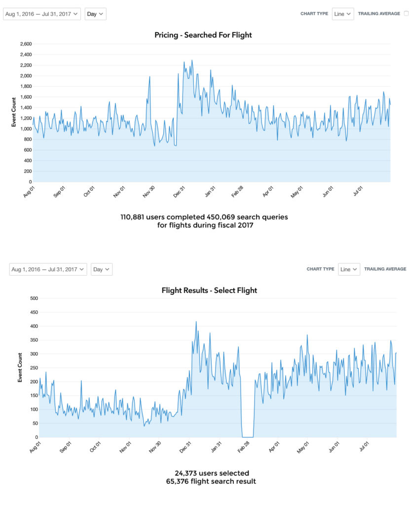
- 450,069 search queries for flights (110,881 users, just over 4 per user)
- 15.5% of all visits to a trip pricing page included a search for flights
- 65,376 times a flight search was added to a booking (24,373 users, 2.68 times per user)
- 22% of users that made a flight search query selected an actual search result
- 388(Google) flight purchases (513 pax, Sales Force) online
- 0.15% conversion rate.
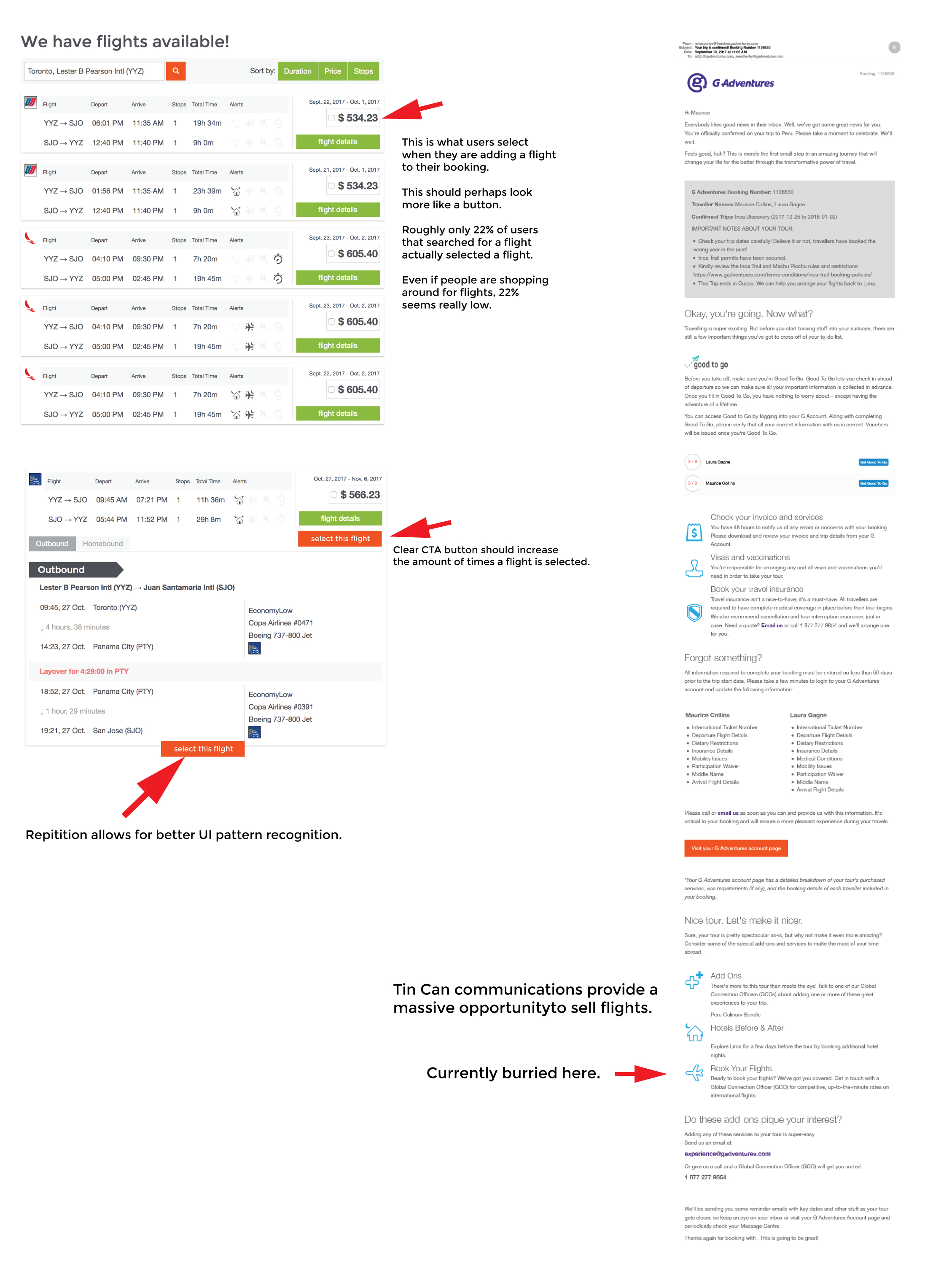
Not great when you consider that even from a comparison shopping perspective, you should get a lot more users selecting a flight to even just see the final cost.

After eating our own dog food, the answer became fairly obvious, it was the UI.

After the first A/B test which lasted 9 days, we had little change. I then added a second variation of the button, running the original select, a green button select, and an orange button select (our tranactional CTA colour), and within 3 days, we had our answer.

Since launch, revenue from flights are up 148.32% with an increase of 166.39% in unique transactions.


