Wippy.com, redesigning a redesign

2022-2023 version
About this project
When I joined Wippy, they were nearing the end of a rebrand (from GoTo Loans) and redesign. Knowing the tight timelines, I made the promise that we would not change anything to jeopardize the launch date, but at some point, we need to revisit this.
Redesigning the Wippy.com website was an essential endeavor aimed at enhancing user experience and aligning our platform more closely with the preferences and needs of our diverse user base. The decision to embark on this project stemmed from a critical analysis of the existing design, which revealed significant shortcomings in terms of usability and inclusivity. The previous design leaned heavily towards an aesthetic that may have alienated a sizeable portion of our audience, particularly male users.

2024 version
By undertaking this redesign initiative, our primary goal was to create a digital space that not only captivates users with its aesthetics but also provides them with clear, concise, and relevant information. We recognized the importance of catering to the diverse demographics of our user base, ensuring that every visitor feels welcome and empowered to engage with our platform. Transitioning away from the overly feminine color palette, we adopted a more gender-neutral approach, striking a balance that appeals to both men and women alike. This strategic shift not only reflects our commitment to inclusivity but also positions Wippy.com as a more accessible and user-friendly destination for individuals across the gender spectrum. Through meticulous attention to detail and a focus on user-centric design principles, we are confident that the redesigned Wippy.com will foster deeper connections with our audience while delivering an unparalleled browsing experience that meets the evolving needs of our users.
We also added a few features that allowed users to make better informed decisions along the way:
• Actual customer reviews (the positives ones at least)
• A payment calculator that allows users to estimate monthly plans without having to give us any data.
• A partner finder that allowed for payment plans from Wippy, again, without providing personal data.
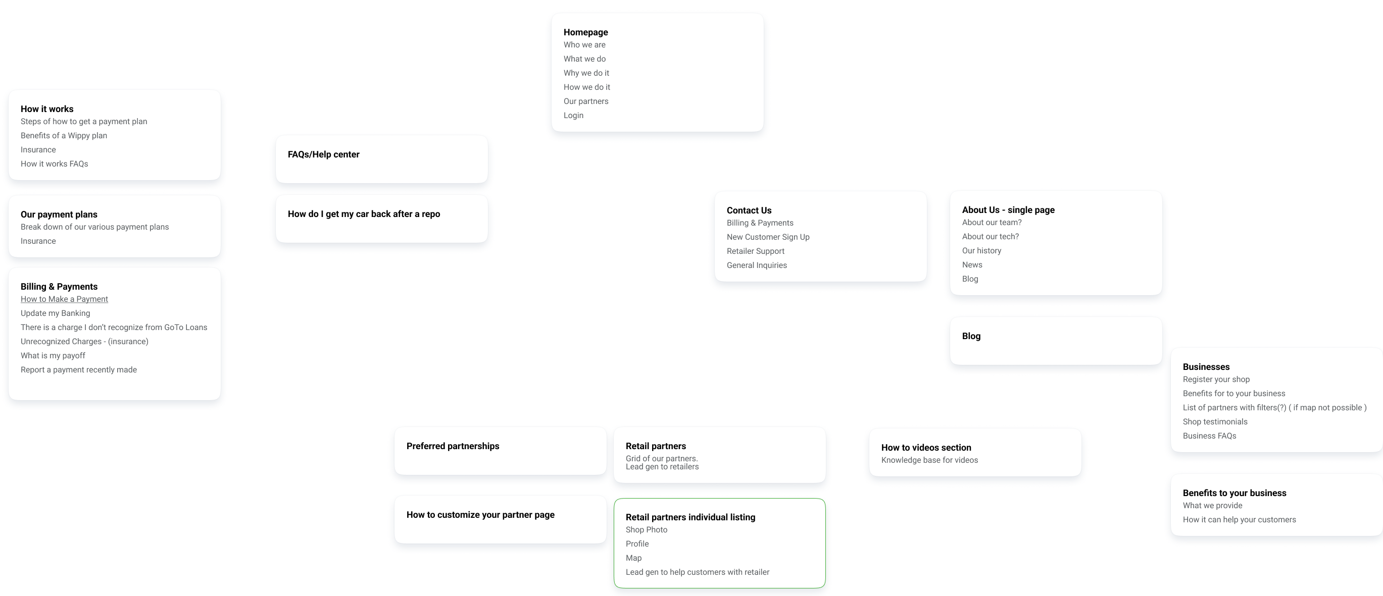
We also took this opportunity to completely overhaul the IA, rewrite all the content to be more user friendly, and better for SEO.

The Impact
For a small business that is not spending any money on advertising, organic web traffic to the site is paramount to ensure the conversion funnel is constantly getting replenished.
User acquisition has increased substantially compared to the previous year, same time frame.

Check out wippy.com.

