Redesigning for conversions – Destinations
Why this test happened
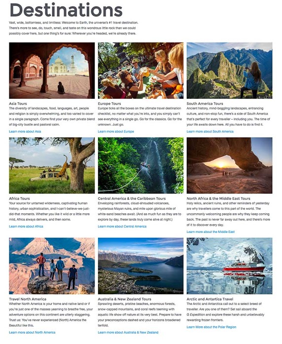
It’s been long believed that /destinations/ is just a gateway page which forces users to click through this page to get to relevant destinations pages.
Test Hypothesis
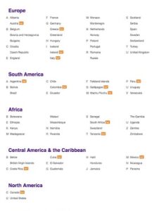
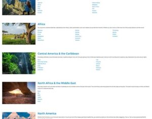
By allowing users to see all the destinations we travel to from this page, and allow them to drill down directly to their country of interest, we would have a higher CTR from this page. We’d also hope to increase purchase volume.
Test targeting
- All visitors from USA, Canada, UK, AUS/NZ
- Traffic allocation 25% across 3 variations plus the control(original)
- Test ran for 14 days
- Design variations created by each of my 3 designers

Design Variations


Testing Results


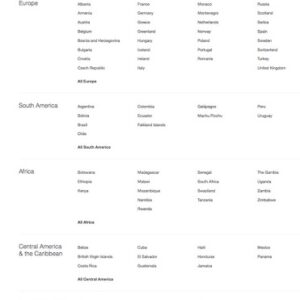
What did we learn? Variation 3 won!
The hypothesis was correct. This page does act as a gateway page. Giving users the ability to drill down directly to a the countries of their choose, removing unnecessary clicks and page views, had a massive improvement on CTR across all variations. The purchases and revenue increases were higher than expected on Variation 3. Page load also got faster as images were not in that variation. Mobile experience for Variation 3 was amazing as well, which helped drive massive CTR.
Winning variations rolled out for .com, .co.uk and .com.au.

