gadventures.com homepage(s)
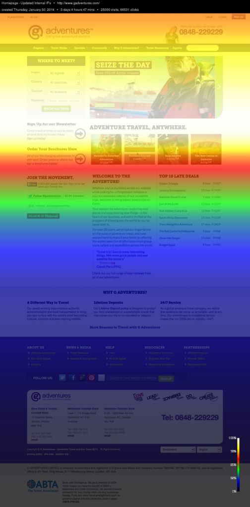
In 2014, we introduced a new responsive framework to help us manage the need to design better experiences for both mobile and desktop. As we saw, our users were using our site much differently than in previous years, so we began with looking at what users were using on our homepage. From our heat maps we saw that more people were interacting with search than any other element on page. This was validated by the search volume from our homepage to our search pages.
The plan of attack, design a page that was focused on trip search, as it was easily our highest revenue generating path. Everything else falls under.


REQUREMENTS FROM 2014:New Homepage Elements, Content Management & Regional Considerations
Elements:
- Hero Image & Entry to Search: This will be used to inspire with destination or experience specific brand images. Entry to search will not include a data. It will be one field that drives the user to the faceted search page where they can filter as desired
- Intro to G Adventures: Quick intro to G and the Why Travel with G video
- Intro to Travel Styles: A brief intro to G travel styles and a link to the travel styles landing page
- Featured Blog Content: This will showcase the 4 most recent blog posts until the blog is moved onto the G Adventures CMS and we have more ability to control this
- Top Seven Lists: Curated lists of trips based on a variety of criteria. A Good place to help promote yield content
- More from G Adventures: Promo for the gear shop, the Looptail,
- Why G Adventures: Permanent spot on this page for Why G Adventures
How to Promote Something on the Homepage & the Website
Homepage presence in the form of a hero spot has been a long-standing tactic for promoting events, discounts, blog content etc. However, with the launch of the new website & landing pages, we will have more flexibility to promote various content on relevant sections of the site. Because of this, the need for a traditional type “Hero spot” is not as important and is not included on the homepage.
To demonstrate the options available, here are some potential scenarios and solutions that may occur and suggested solutions to demonstrate the flexibility of the new homepage and website pages:
- Future of Tourism or similar event: For special events & other important events, we can include this in the more from G Adventures section or if its important enough, give it its own content block.
- Philippines Style Fundraising Initiative: This type of large initiative can be added as a complete row/block with a link to a landing page to learn more.
- Trip Specials, Discounts, EBB, Urgent Promos & Links to Landing pages etc. We’ll create a “hero” style carousel on the specials page. Because this has such a prominent placement in the nav, users with intent to view specials will get to see the one’s we’re highlighting.
- Global Events & Blog Content: This can be featured in the recent blog content section.
- Theme Weeks: We can utilize a content block for this or place a box in the more from G section.
- New Product Offerings: Depending on the size of the launch, it can be included on relevant destination and travel style pages.
- Regionalization & Process for Updating the Homepage
Homepage content should definitely reflect market conditions from the hero image, to the featured posts, lists etc.. While full regional focus is a long-term objective for the homepage, at the outset, we will only have the ability to regionally control a few elements including the following:
- The Hero image
- More from G Adventures
- Addition of individual content blocks for important initiatives

2018 version:
Over the years, I’ve worked on constantly improving page speed and optimizing the homepage to drive revenue out of the most valuable paths via A/B testing.
Over the years, I’ve worked on constantly improving page speed and optimizing the homepage to drive revenue out of the most valuable paths via A/B testing.

2019 version:
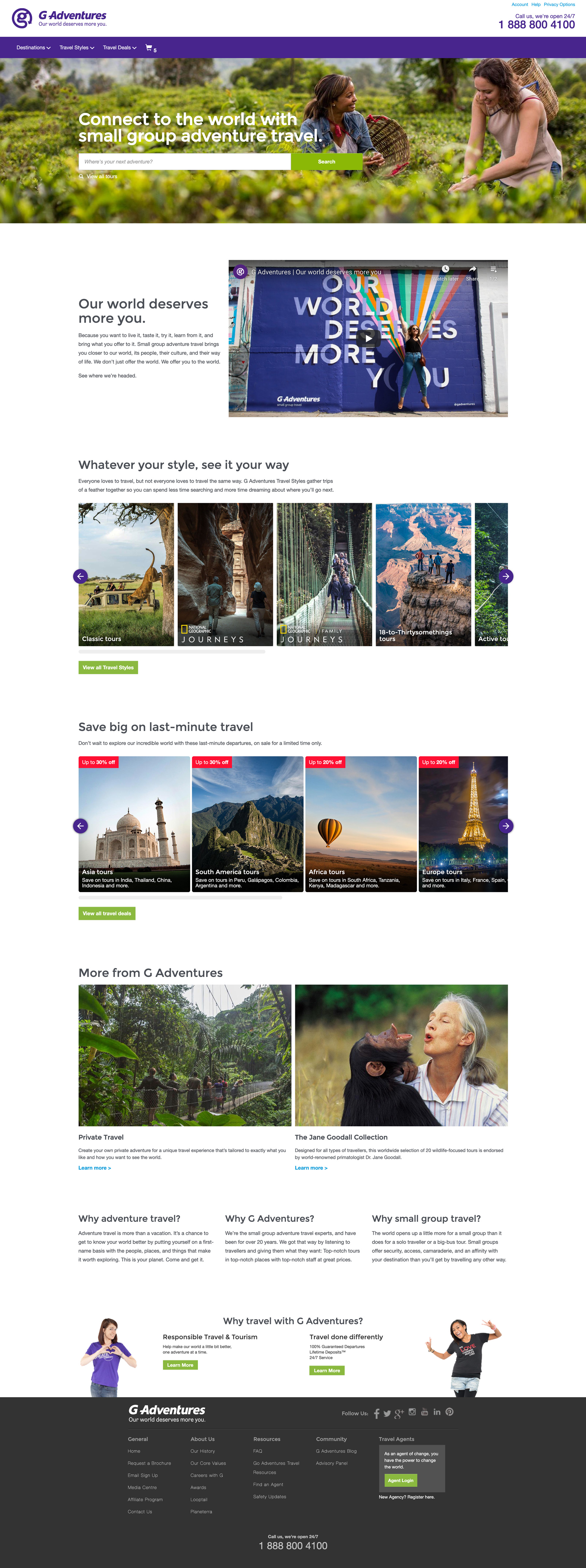
This version began to reduce down the amount of content on the homepage to help drive qualified traffic to the appropriate pages all while bring back the focus on the core of the business, tour experiences.
This version began to reduce down the amount of content on the homepage to help drive qualified traffic to the appropriate pages all while bring back the focus on the core of the business, tour experiences.


