Affinity based product recommendations
Why this test happened
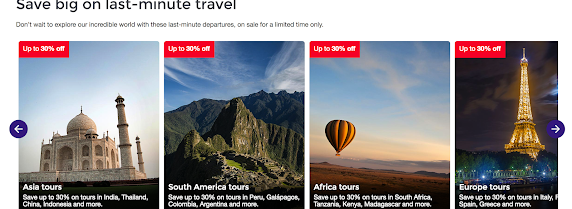
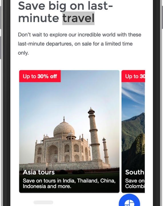
With a corporate priority of drive more sales for departures leading to end of fiscal, there was a need to incorporate easy access for users to trips on sale from the homepage. Based on most user behaviour data, the tiles were set up via regions, driving users to the correct search page. With a new UI (user interface) introduced to showcase more options, there was the possibility that users wouldn’t see all the regions on sale.
Test hypothesis
Setting up an initial order of appearance, based on E-Comm data (best performing regions), and then using Affinity based audiences to re-arrange the order of the tiles so that users will see the tile that’s associated to their shopping behaviour first, would help drive higher purchases. This would also ensure that tiles further down the priority order, would get visibility to the users that are more likely to purchase those.
This would also help us validate whether this UI works for user behaviour.
Test targeting
- All visitors
- Homepage and Travel Deals page
- Desktop and mobile
- Traffic allocation 50% Affinity, 50% Control
- Initial order of tiles – Asia, South America, Africa, Europe, Central America, NAME, Aus/NZ, North America
- Ran for 23 days
Audience variations & performance
Default view and Asia affinity


South America affinity

Africa affinity


Europe affinity

Central America affinity


North Africa & Middle East affinity


Australia & New Zealand affinity

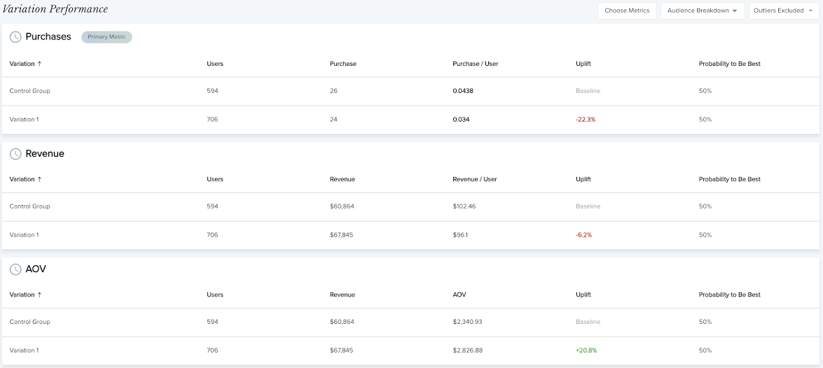
North America affinity


What did we learn?
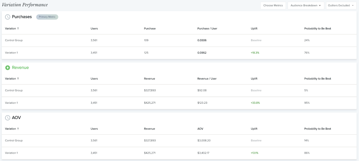
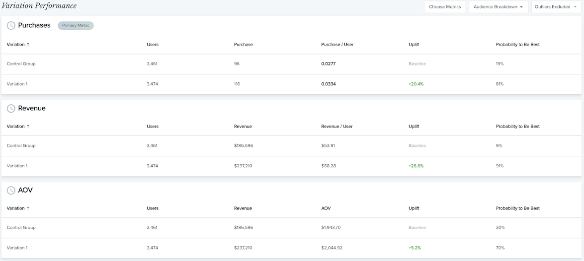
In most of the variation, we saw an increase in purchases and a substantial increase in revenue.
Showing users relevant regions, and discounts based on what interests them, does help drive conversion. Also, new UI, worked well and provided a better mobile experience for users, as we saw a major spike in purchases among the strongest performing audiences.
As overall results were strong, new targeting has been set to 98%-2% control.

